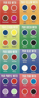
STYLE ZONE WITH I style: HOW TO COORDINATE COLOURS!
HOW TO COORDINATE COLORS
A beautiful morning to everyone out there, I for one have been having a fun filled week in the city of Excellence, Lagos Nigeria. Last week we started a series on color coordination, and it's an issue that we can't hurriedly exhaust, hence it's continuation this week.
Color Coordination is not the sort of thing that anyone is born knowing how, Sometimes it can be difficult to know which colors you should wear with that green shirt or that blue skirt... but there are some definite rules that govern which colors look best with one another. Of course, once you know the rules you can break them, but it's good to get the basics down first.
1. Use the color wheel. All the color wheel does is tell you how best to combine colors.There are particular color combinations in the color wheel that are really appealing to the eye, called color harmonies.
When a color is tinted that means that it's getting lighter (has white added to it) and when it is a shade it is getting darker (has black added to it). Tones in a color are created by adding grey. When you're coordinating clothes you'll need to see how different tints, tones, and shades work with one another.
2. Avoid complementary colors as much as possible. These are the colors that emphasize one another and are opposites on the color wheel (say for example, orange and blue). Don't let the name fool you, these colors are complementary to one another and that doesn't mean that they'll be complementary to you!
Now, you don't have to avoid pairing complementary colors completely, especially if you're a bold and confident dresser, (remember the thing about, knowing, understanding and breaking the rules to suit your personal sense of style) . A good way to use complementary colors to good effect is to pair 1 complementary color with a paler tint of its opposite color. For example, pairing a royal blue dress with a pale gold shawl and shoes.
3. Use analogous colors. These are the colors that are right next to one another on the color wheel, like green and yellow or red and orange. Because they are close to one another they appear easy on the eyes when paired together. Try to avoid putting no more than 3 analogous colors in one outfit, so you wouldn't go overboard and look like a party clown.
4. Use primary colors. Primary colors (if you can think back to your basic schooling years) are red, blue, and yellow. These are hard to pair together unless you're really brave, although they can look great when done right. Primary colors are great, though, for the monochrome look, which means that you use only one color.
5. Use neutral colors in your outfits. White, black, and grey are neutral colors (and are very important for properly coordinating clothing).
This is one of the most important pieces of advice for creating well coordinated outfits. The neutral colors will enhance your chosen colors and will make them look better coordinated and not overdone.
6. Practice! You need to play with colors to find out from personal experience that you might not want to merge certain colors.
Comments, suggestions and criticisms are highly welcome.
Post By: ISAAC OJONUGWA JOHN
Reach out on IG @aizyq___ @istyle.enterprise on FB John Isaac Ojonugwa.
The Tellrhodes blog!
Check out our other Amazing sections on the left side Bar.
IG: tellrhodesblog
FB:The Tellrhodes Blog
YouTube: tellrhodes
Gmail: tellrhodes@gmail.com


Comments
Post a Comment